The labor required to keep civic apps alive
Published on Oct 9, 2015 by Derek Eder
The CPS Tiers map doesn’t update automagically. I volunteer my time to keep it accurate and up to date, and it’s worth doing.
Building new civic apps is a lot of fun! I’ve been doing it for a while now and created quite a few.
But once you’ve built something, it’s kind of like getting a puppy. You gotta be a responsible adult and take care of it.

Unfortunately, apps are rarely maintained in the civic tech world. Just take a look at all the dead projects from the Apps for Metro Chicago Contest, which only happened 3 years ago.
I just updated Chicago Public School Tiers with data for 2016-2017 school enrollment and wanted to share the steps I went through to do it.
It involves a government website, extracting data from a PDF document, manipulating spreadsheet data, merging datasets using Google Fusion Tables, and customizing a set of interactive map stiles.
But first, if you haven’t heard of this tool before, here’s what it’s about:
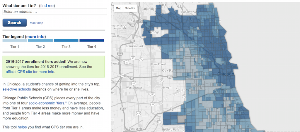
About Chicago Public School Tiers
In Chicago, a student’s chance of getting into the city’s top, selective schools depends on where he or she lives.
Chicago Public Schools (CPS) places every part of the city into one of four socio-economic “tiers.” On average, people from Tier 1 areas make less money and have less education, and people from Tier 4 areas make more money and have more education.
Chicago Public School Tiers is a tool to help find what CPS tier you are in.
This civic app, created by me, Forest Gregg and Juan-Pablo Velez in March 2012 continues to be one of our most popular projects, netting between 2,000 and 4,000 unique visits a month.
CPS parents really need to know this information, and CPS Tiers continues to be the easiest way to find it.
Ok, on to how I update it.
Step 1: Finding the source data
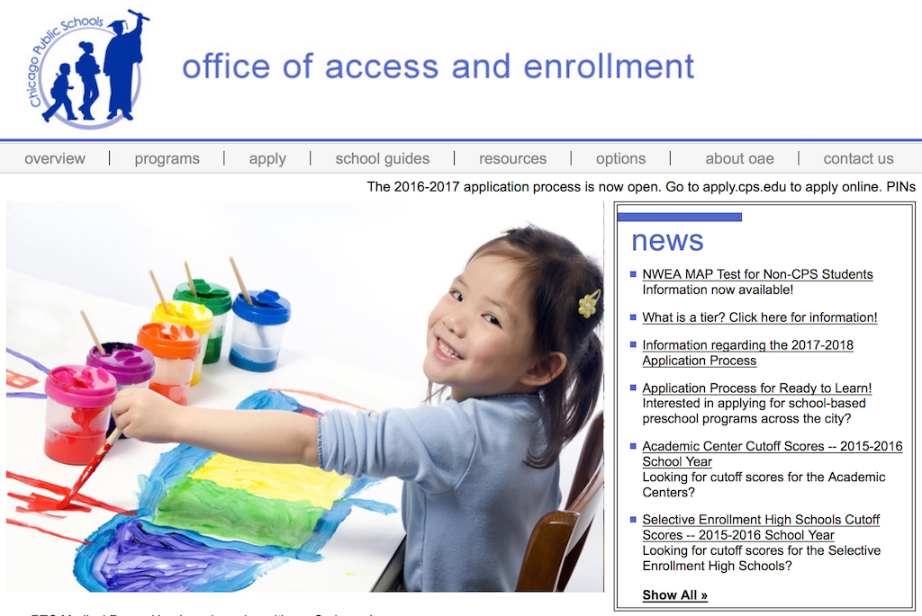
The tier information is posted by the Chicago Public Schools Office of Access and Enrollment on their website.
The Office of Access and Enrollment post updated tiers every year in early October ahead of the enrollment deadline for the upcoming school year.
Also shown on this page are the official instructions provided to parents for looking up their tier:
You can also calculate your tier by following the steps below:
- Click here to go to the U.S. census website.
- Enter your address and click ‘go.’
- Scroll down to the table entitled “Geography Results.” Under the column “Geography Name,” look in the sixth row for your census tract number, followed by the county and state.
- Click here to access the “Census Tract to Tier for Chicago” document. The census tracts are sorted in numeric order; the number in the “short tract” column corresponds to the census tract number you obtained on the U.S. census website. Click “Control F” and type in your census tract number. The number in the third column is your tier.
Here’s a screenshot of these instructions for posterity:
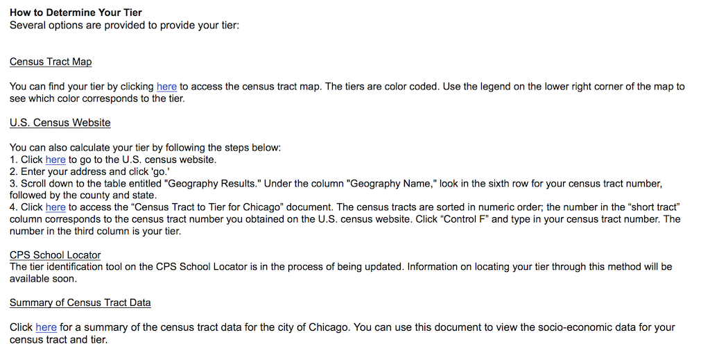
As an aside, when we first came across these instructions, we thought it was about 3 steps too many, and decided we could use our technology skills to help out parents a bit and built the CPS Tiers app.
Anyway, there’s a link at the bottom of this page we care about: the Summary of Census Tract Data for the current year’s tiers. It’s a PDF file containing tables of data.
Step 2: Extract data from a PDF using Tabula
Many governments like to publish data as PDF files. This makes for easier reading by people, but it’s hard for doing much else with them. We need to get this data into a format we can work with - CSV.
Sometimes you get lucky and you can just select the text and paste it into your spreadsheet editor of choice (I prefer LibreOffice - it’s free!). Most of the time, however, the data isn’t copy/paste-able.
Thankfully, there’s Tabula, a free and open source tool for extracting tabular data from PDFs built by Manuel Aristarán, Mike Tigas and Jeremy B. Merrill with the support of ProPublica, La Nación DATA, Knight-Mozilla OpenNews, The New York Times and The Knight Foundation.
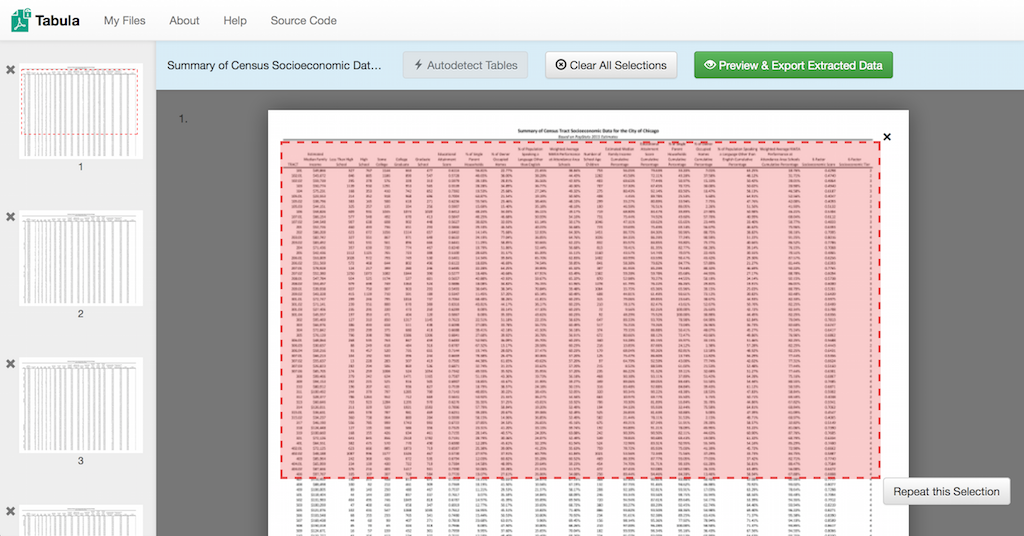
Just run the Tabula app, select your PDF file to extract, and use their handy interface to select the text you want to extract for each page. Our document is 10 pages, so I select the tables (but not the headers - those get repeated on every page) on each one.
Click ‘Preview and Export Data’, copy to the clipboard, and fire up your spreadsheet editor.
Step 3: Clean up the extracted spreadsheet data
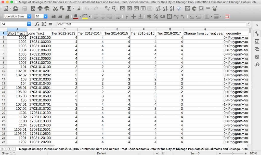
Tabula just did a ton of work for us, but we still need to clean up a few things. The headers had line breaks in them, so we’ll need to combine those each into one cell. At this point, I also pull in the tier data from previous years so I can keep a history of the tiers and how they’ve changed over time.
I also create a new column called ‘Change from current year’ that is the difference between the 2016-2017 tiers and 2015-2016 tiers. I’ll be using this later to make another map (step 6).
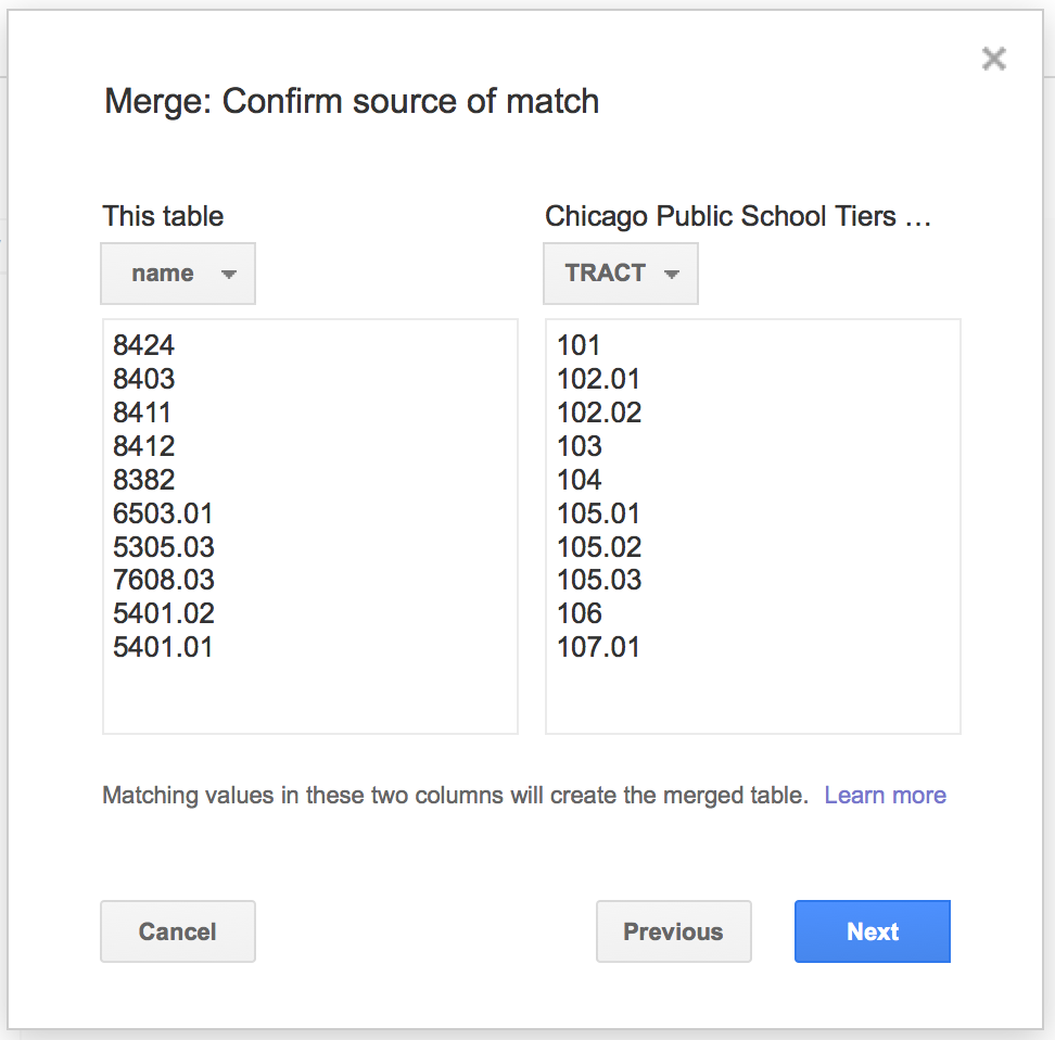
Step 4: Merge with US Census Tract shapes
Once I have my data cleaned up, I upload it to Google Fusion Tables.
Fusion Tables is a free service by Google that makes it really easy to make maps (and other visualizations) out of spreadsheets. I use it quite a bit and have a popular open source template for making custom mapping websites with it.
CPS Tiers is powered by Fusion Tables, but we also get another cool utility out of it: table merging.
Each CPS Tier geography is actually a Census Tract, a geography determined by the US Census that contains, on average, 4,000 people. To make the map of tiers, I need to take the data I extracted in the above steps and merge it with the shapes of each Census Tract.
I could go get this data directly from the US Census, but the City of Chicago already makes the tracts in Chicago available on their Data Portal. Yay!
I download the tracts shapefile in KML format and upload it to Google Fusion Tables too.
Now I can use the Fusion Tables merge feature and combine these two tables into one master table with both my data and my geographies. Neat!
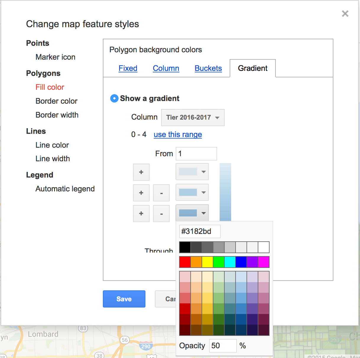
Step 5: Customize the Fusion Table map styles
Next, I customize the Fusion Table map styles so we can tell the difference between the 4 different tiers. For displaying tiers numbering from 1 thru 4, it’s simplest to use a sequential set of shades using a single hue (blue in this case).
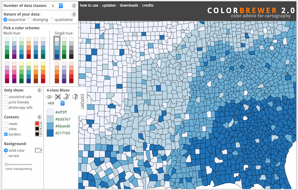
Here’s a little tip: picking colors for maps is actually pretty hard. The default colors that Fusion Tables give you are pretty crass, and it’s really challenging to find colors that are both easy to tell apart and work for those who are colorblind too.
Thankfully, Cynthia Brewer, head of the Department of Cartography at Penn State, created a tool called ColorBrewer to help us pick good map colors.
I picked 4 data classes, sequential, and the blue single hue.
Step 6: Create a map showing the tier changes
I’m not quite done yet. I want to make a second map that shows which tiers have changed since last year and how.
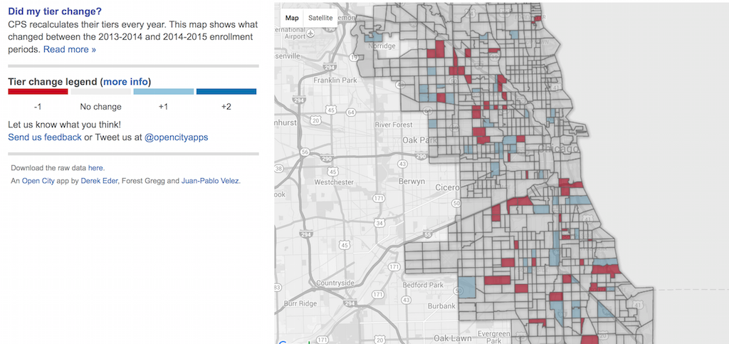
For this map, I color each shape using 3 data classes, diverging, and using red (tract went down a tier) vs blue (tract went up a tier).
Step 7: Update cpstiers.opencityapps.org
Finally, my maps are done! All that’s left is to swap out my Fusion Table ID, since I created a new one, and update some text throughout the site.
The code for the CPS Tiers website is open source on GitHub, and you can see every change I made using this handy comparison view.
And I’m done! Until next year, when the tiers are updated yet again.
Why this matters
I’ve been updating CPS Tiers this way for the past 3 years. I’ve met and talked to parents that use it and heard from some of them just how challenging and unfair the Chicago Public Schools selective enrollment process is.
This app is one way we, as civic technologists, have found to make the lives of some Chicagoans a little bit better. That’s why we built it in the first place.
And it’s for that exact same reason that I take the time every year to keep it going. If we are truly doing this work to improve the public good, then we need to put energy into maintaining, and not just building, civic technology.

About the author

Derek Eder
Derek is an entrepreneur, developer and one of the leaders of the civic technology community in Chicago. He is a co-founder and partner at DataMade — a company that tells stories and builds tools with data — and is the lead organizer for Chi Hack Night.